I unfortunately designed/produced, wrote, and shot nearly almost everything on this page out of necessity although I was fortunate enough to have had some great contributors on a couple of the pieces (talented people are always busy). Without their involvement, it would not have been a worthy portfolio piece.
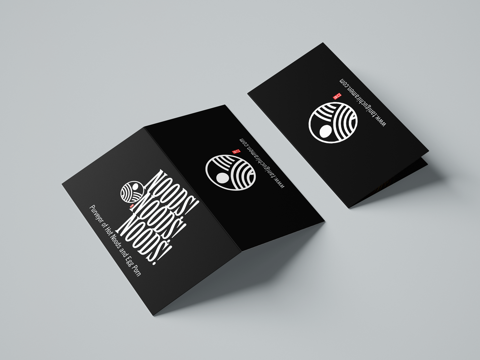
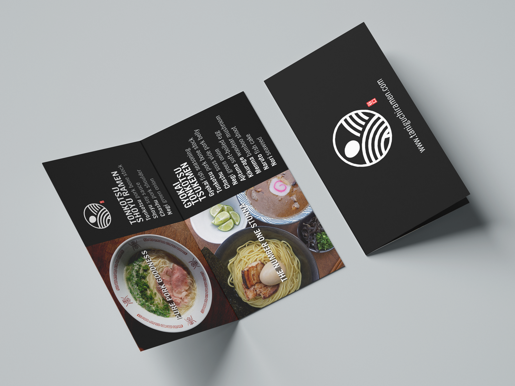
taniguchi ramen
Taniguchi Ramen is are my series of pop-ups in Denver, Colorado to test the market, adjust my menu, and to give myself some time to ramp up operations..
Tent cards
These menu cards were done up to provide the correct product/menu spelling and description (although even with it, I still see influencers who still spell it “tonkatsu” vs. “tonkotsu.”)
Solfa / tokyo, japan
EDM nightclub promoters in Tokyo, Japan.
EFLYERS

Optimized for use on Facebook and IG
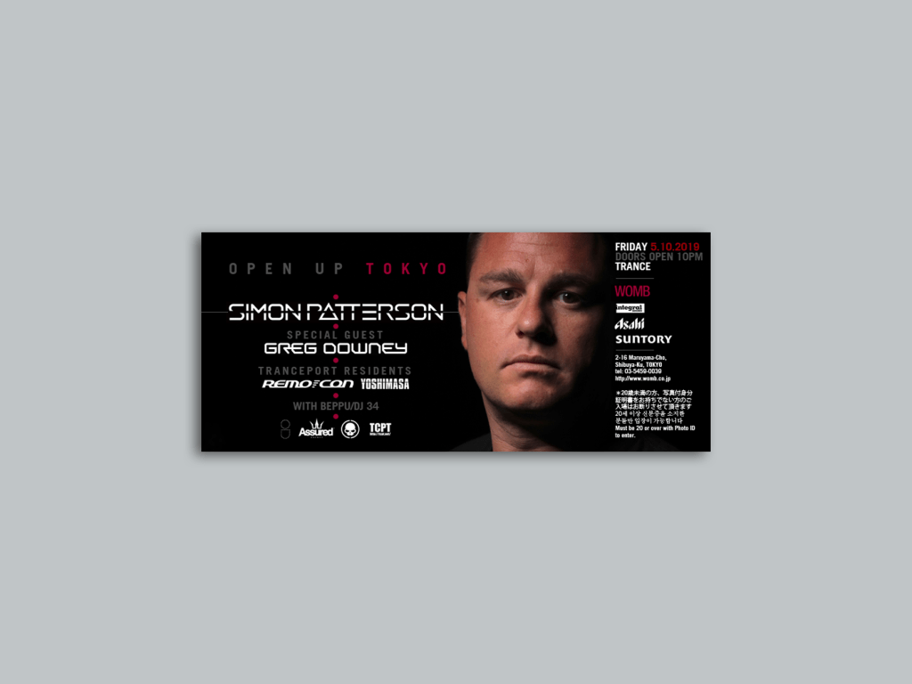
womb / tokyo, japan
Womb is a very famous club in Shinjuku, Japan and it appeared in the movie Babel with Brad Pitt.
eflyers

Scaling a consistent look and feel while being optimized for each platform (web, Facebook, and Instagram) was all part of the design criteria.
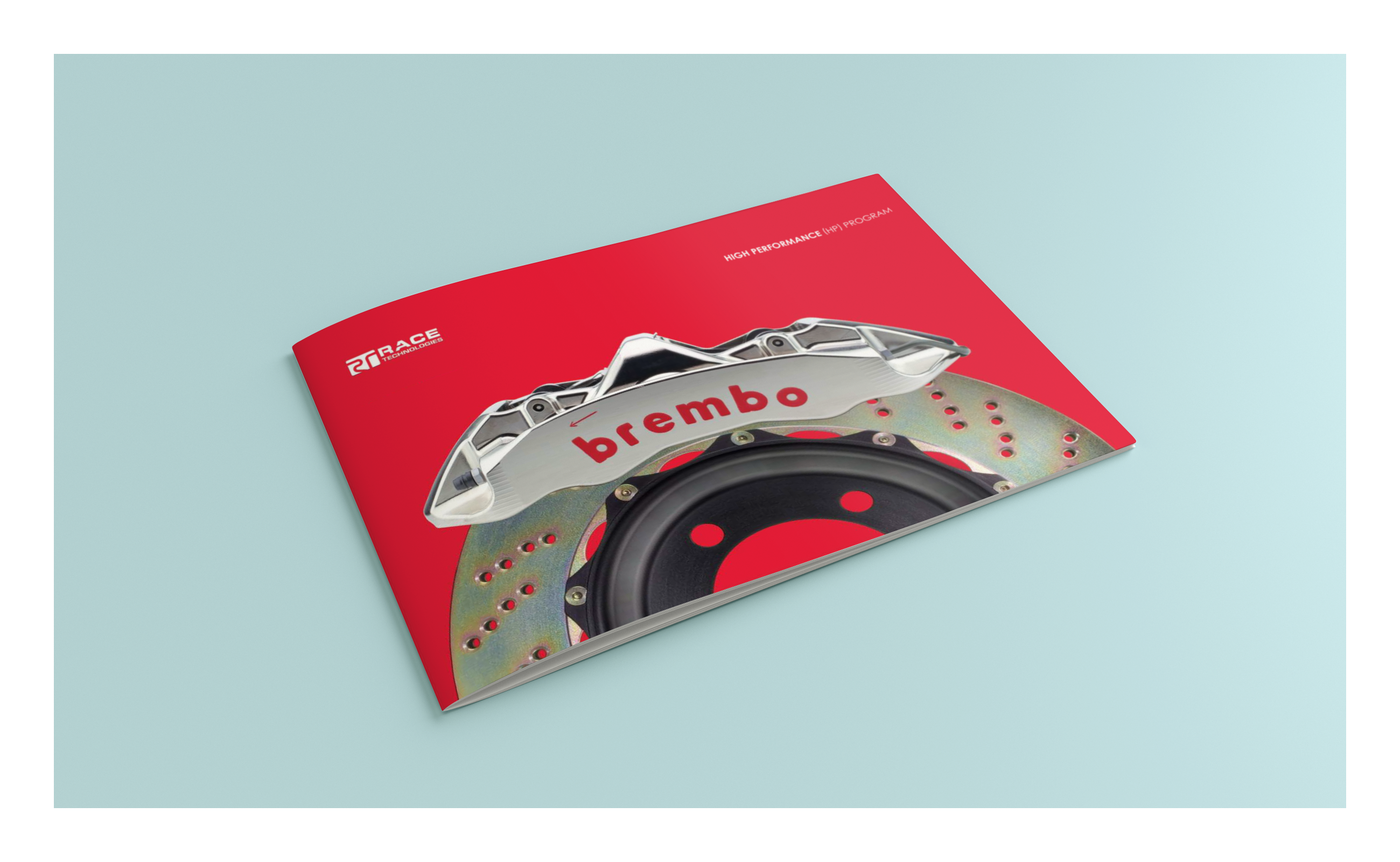
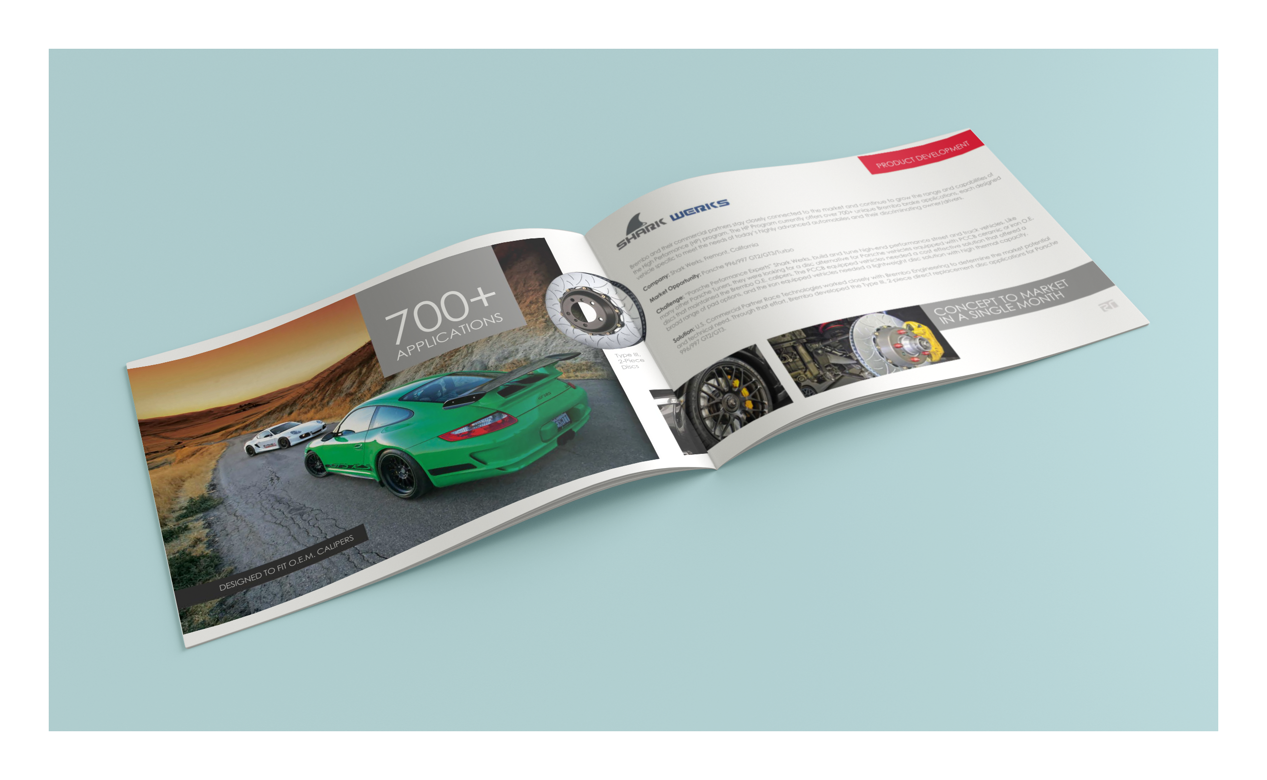
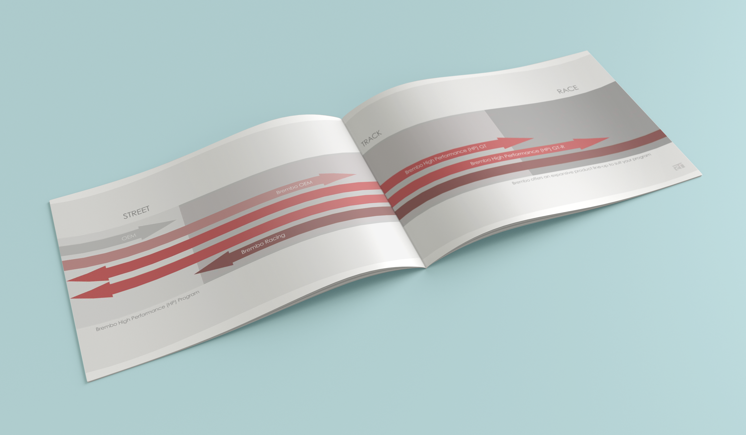
Race Technologies
At Race Technologies I wore many hats even though my title was Marketing Director, I was also the lead UX researcher, photographer, to graphic designer.
Booklets/pamphlets

I was able to quickly produce this piece in about 2-days which did not turn exactly the way we wanted it due to time constraints, issues with licensing (NASCAR), and a lack of relevant imagery from our partners.

- 8.5×5.5 horizontal booklet: this piece was developed with the founder of the company in about two-weeks. The booklet was designed to be distributed to dealers and distributors to communicate RT’s role as it relates to Brembo.
- Bi-fold brochure: developed as a sales handout to off-road race teams to highlight the competitive advantages over the competition. This piece was turned around in about 2-days.
- “From 100 to 0 km/h”: a print ad developed for international dealers utilizing the Brembo style guide.
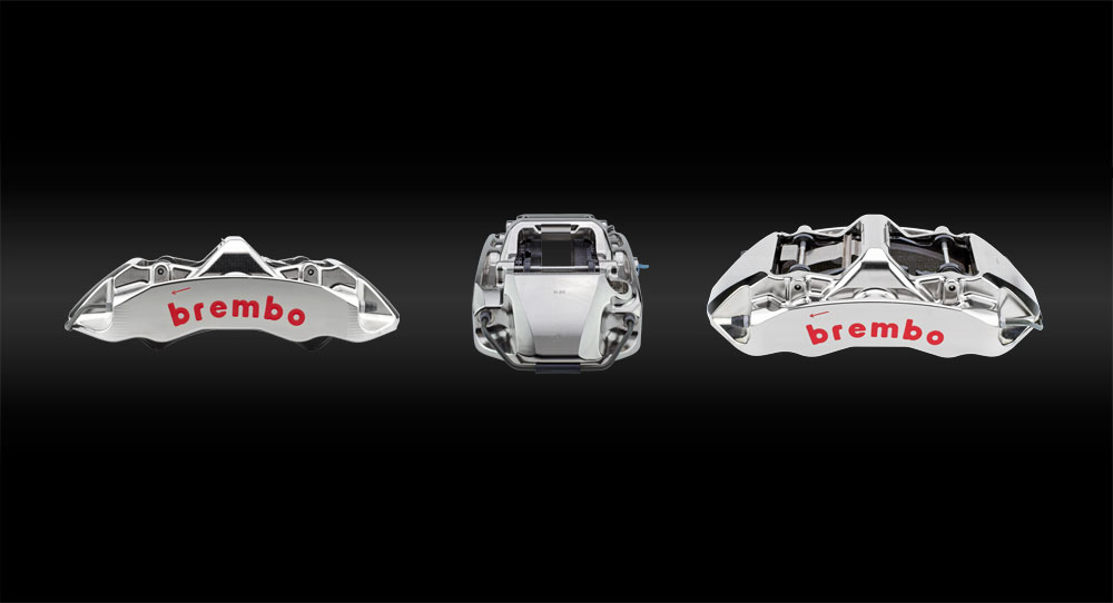
Product photography
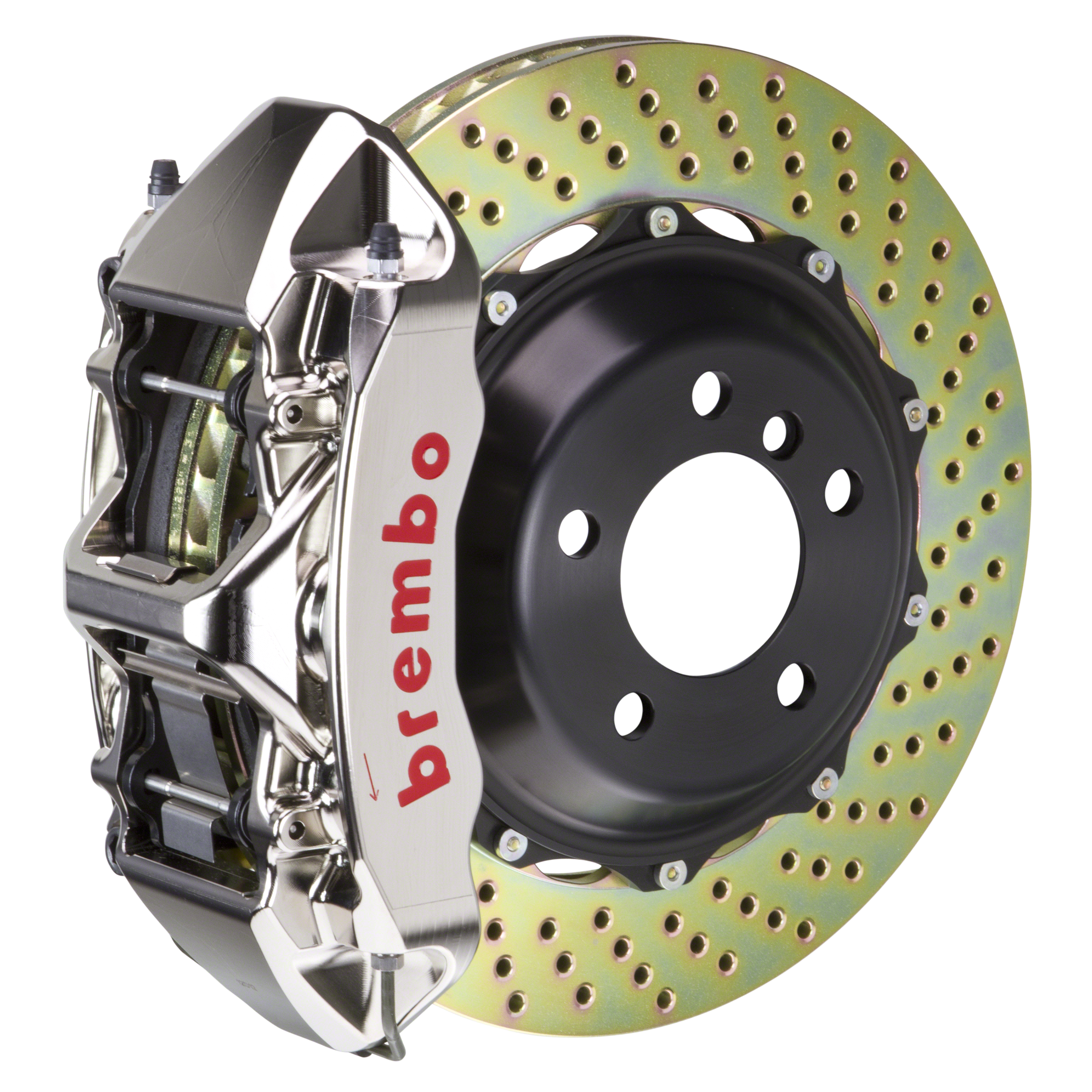
I had a specially designed jig designed, so that we could correctly depict the clocking of the caliper to either a “leading” (pictured above) or “trailing” setup.
The vast majority of product shots were done with the caliper balanced atop the disc at a 12 o’clock position out of ease which is not representative of an actual brake system set-up.

- 300+ images: Brembo Performance and Brembo Racing product photography.
- Marketing objective: all the other brake brands shot their product with the caliper and disc separately, or they had it balanced atop the disc out of ease of shooting. In order to further fulfill our service value, we had a special jig designed and built, so that we could have the discs mounted in a leading position (it is either “trailing” or “leading”). Having the correct clocking position would help to further communicate and educate our dealers, distributors, and end users on how a real brake system looks like when installed on a vehicle since a caliper is never mounted in the 12 o’clock position, but it is either at a roughly 3 or 9 o’clock position.
- Post-production: for Brembo Performance, I had done some color correction and minor post touch-up, but we decided to leave Brembo Racing in its raw state. *We outsourced clipping paths (thanks Freddy).
- Sidenote: previous images of the machining marks created during the CNC machining of the billet had been Photoshopped out by the previous creative because they thought it distracted from the images, but they should be left in because it exemplifies the technical expertise of producing a product of this calibre.
Surprisingly, until I came to Race Technologies, neither RT or Brembo had signficant product photography library of their products.
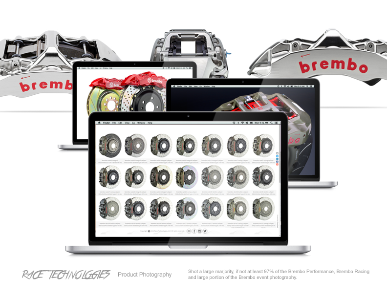
A couple hundred components were shot to represent several hundred brake systems.
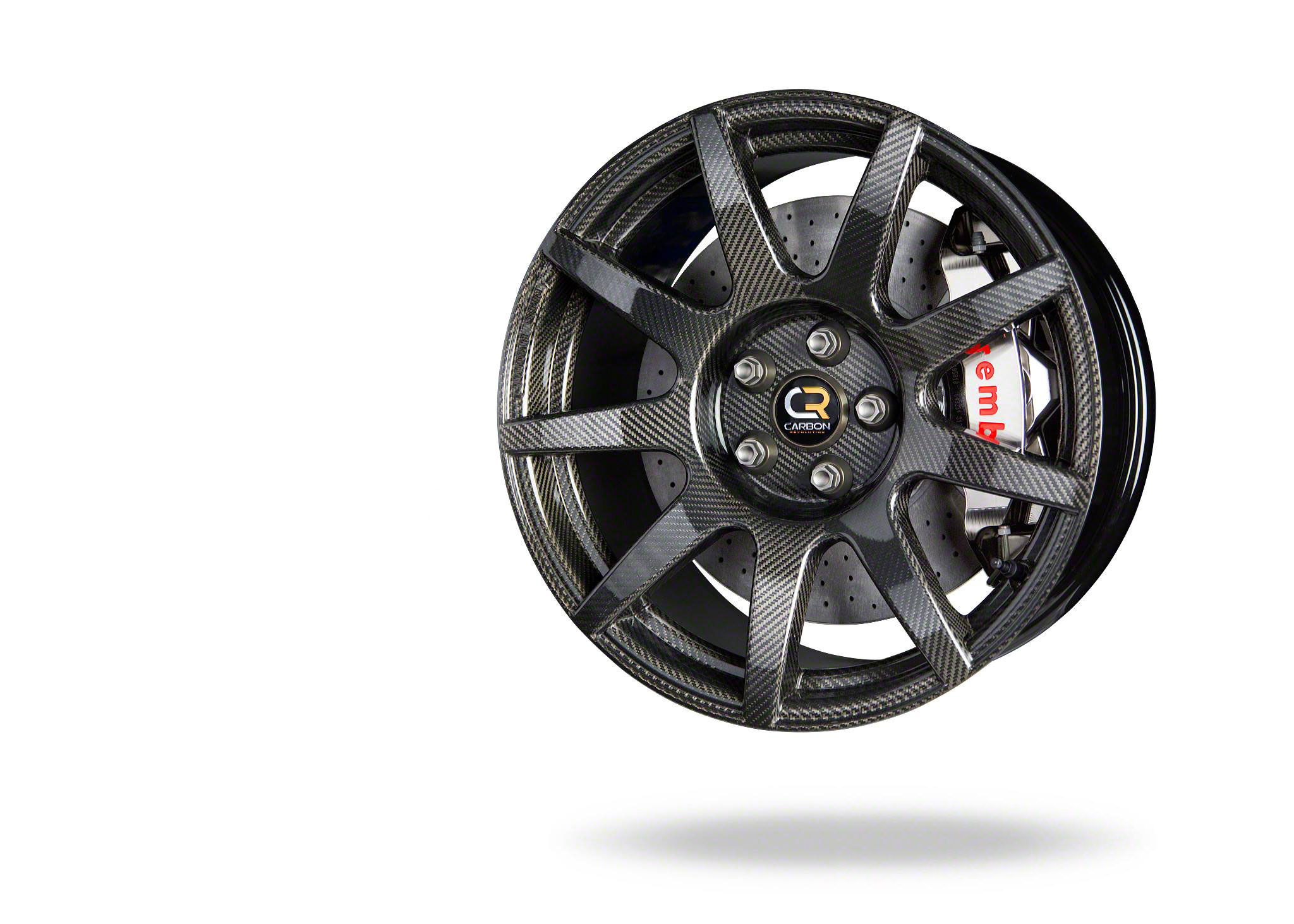
To further emphasize the cutting edge technology utilized by Brembo, we collaborated with Carbon Rev a manufacturer of carbon fiber wheels.
The extremely lightweight set-up you see here is a carbon ceramic disc produced for racing (CCM-R), and a Brembo GTR forged billet caliper with stainless steel piston inserts for the widest range of performance from street, track, to racing.
Event collateral
- The challenge: the previous set-up was a fold-out table, a black table cloth that a magician would use, and a number of the products simply just propped up on the table as a conversation piece. Although, the absolute worst part, is that they have a number of people standing behind the tables for you to come up with a reason to engage them which defines the experience.
- Solution: If I was going to continue to do events, I had to get away from that brand experience by doing the following:

From the race tiles, canopies, step and repeat, to all the signage, I produced all these pieces so that the experience could be a passive one that was not solely dependent upon engaging a sales associate.
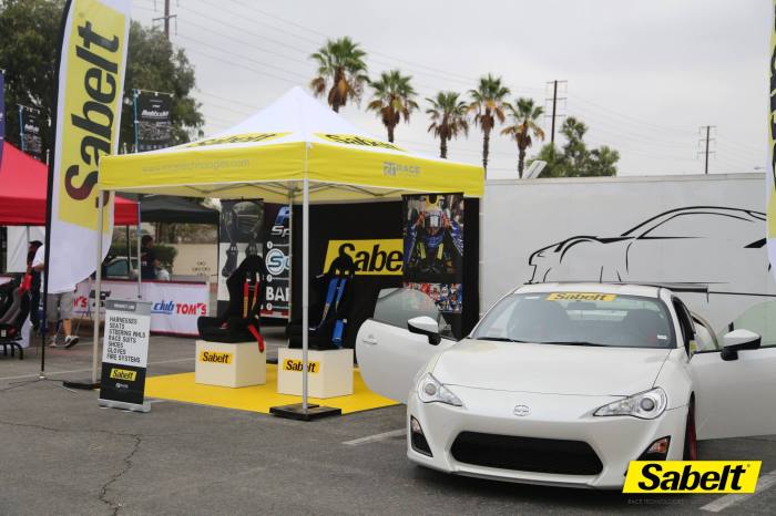
Regardless of what size booth we had, I had to make sure that I defined the space with identifiable brand elements in which one aspect is simply by color (think T-mobile (pink), AT&T (blue), Verizon (red and black), to Sprint (yellow).

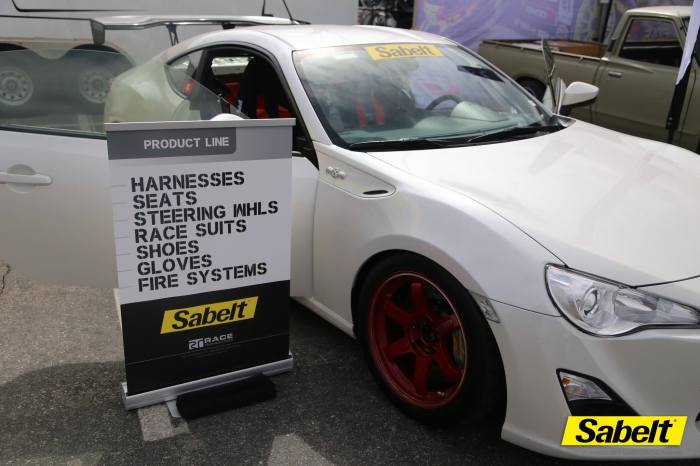
Sabelt did not have a brand guideline, so I utilized their catalog to provide those brand elements. On the other hand, Brembo has strict brand guidelines, so that required a little more work although it was also more straightforward to do.
The biggest missed opportunity with their previous events is that they never dictated the narrative or how event goers should engage the brand. That is why, all the signage that we produced was meant to guide the conversation.
Business Cards
- Test cards: These were cards we comped on a gang-run press because the actual card had an embossed front with an aqueous soft-touch laminate.
- Developing the RT look and feel: programs and staff had changed over the past five years, and so the card designs had to be changed too.
- Style guide: another comp where we had used the early packaging designs that Italy had been doing for the new Brembo Performance systems.
- Results: the sales staff was really skeptical about having new cards, but once they got them and started to distribute them they became a conversation starter. The reason for that is that I chose to use an Aqueous soft-touch laminate. The RT logo itself was embossed (white on white).


During the process of developing the RT identity, we had to produce a few cost-effective designs for new staff.

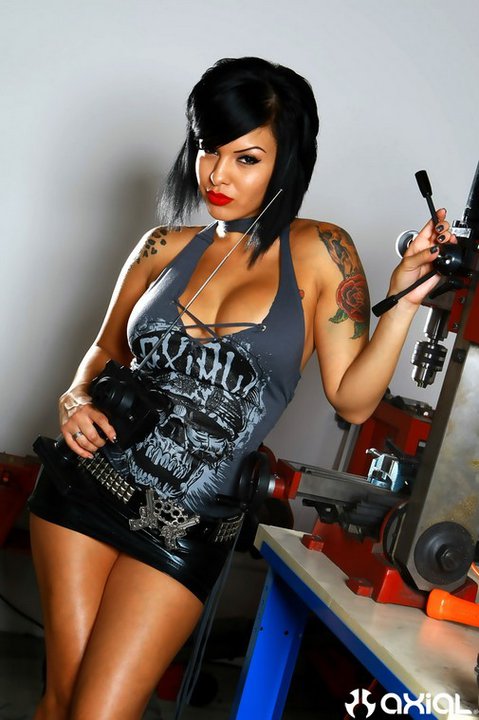
Axial
Axial is a leader in the hobby grade radio control (RC) industry for off-road rock crawlers which was a product they had pioneered and are one of, if not, the industry leader in the segment.
Magazine advertisements
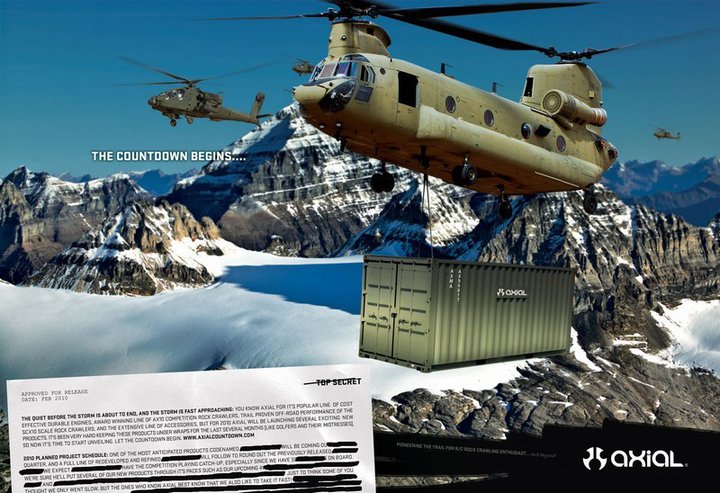
The Apaches, Chinook, and shipping container were all photoshopped (composited) in, and this was the second ad in the product launch campaign that took place during an 8-9 month period.
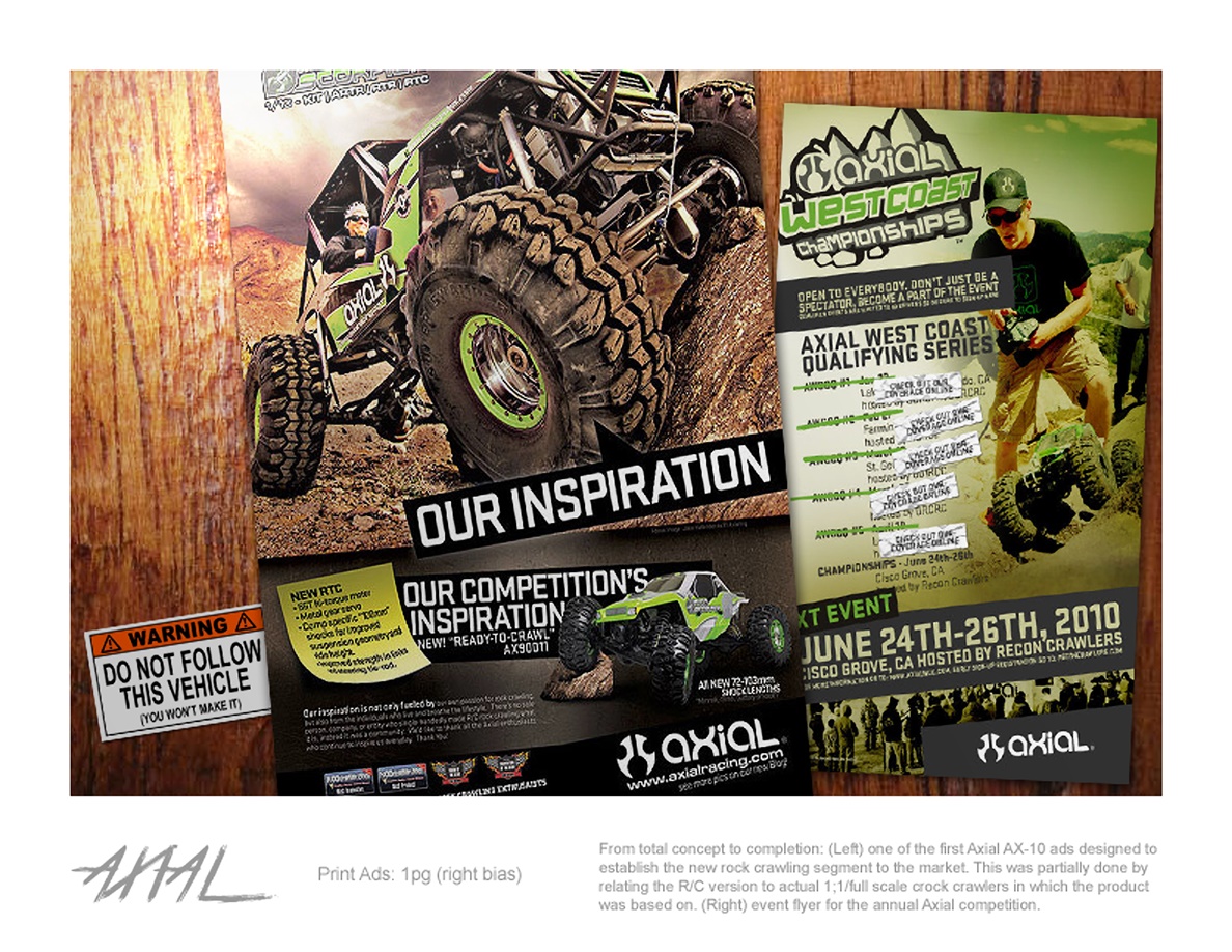
- Advertisement (left): the marketing objective was to establish Axial as the leader of R/C rock crawlers. The print ad was run every other month for six-months to stake Axial’s claim as the first to come out with a rock crawler because several competing companies were following suit with their own rock crawler.
- Event poster (right): annual event that utilized the newly established Axial style guide.
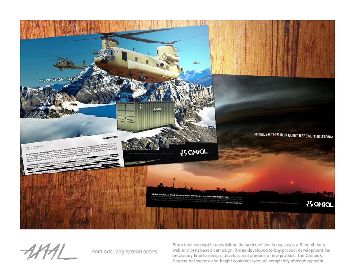
- Marketing objective (the 1st ad was on the right, the 2nd on the left): I was given the task to try and buy our product development team at least 6-months till they could develop, design, and produce a new product. My solution was to run a print (this industry was a slow adopter to digital) and digital/influencer campaign. As to how it was received, well, this is the ad that everybody probably remembers Axial for because every R/C company had always included a shot of their product, so I made sure not to have one which created a ton of buzz.
Textiles
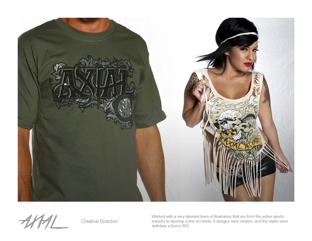
- Creative brief: I wrote one to develop the illustrations we were looking for. From that brief, the very talented dudes over at Soup Graphix in San Diego, CA were able to come through with these illustrations and several more not pictured. The images were shot by Dan V.