Automotive aftermarket to the R/C industry
I unfortunately do not have imagery of all the projects I worked on although I did manage to find some imagery.
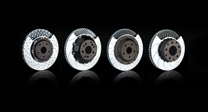
I had done packaging for coilovers (Skunk2), a muffler (Gibson), a number of packaging solutions for hi-end, hobby grade radio controlled vehicles (Axial), and most recently some comps for a brake pad and seat bracket program intended for the motorsports market (Race Technologies).
As you can see, I have a predicatable look and feel which is why I would rather work with a graphic artist to develop a distinctive design that reflects the brand.
Race Technologies
My role: branding, marketing, graphic design, copywriter.
The challenge: to produce a brand for a pad program to remain “neutral” in the racing paddocks.
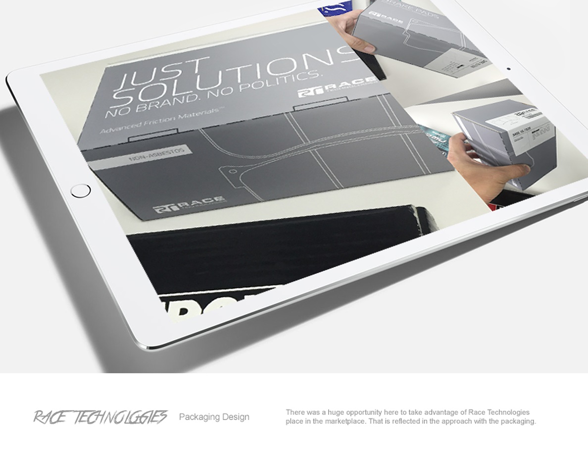
Solution: the proposed solution would be to be as straight forward as possible with “just solutions” which is a play off of the brand slogan which is “be the solution.”

The pizza box was a rough concept just to convey the simplicity of the “generic” packaging.
Axial
My role: branding, marketing, graphic design, photography, creative director, copywriter.
The challenge: I can’t count the amount of times I have asked a sales associate about a product, and they went straight to the product packaging to find the answer. This was an even more common issue because the product was also the first of its kind in an entirely new product segment of “rock crawlers.” Since the majority of sales people were not aware of what the product was capable of, I wanted to have a standardized area with iconography on the box that would state the specifics. This prevented the need to have to flip the box numerous times searching for the answer (this was something I had done at Skunk2 with their packaging).
“How many times have you seen a sales associate have to look at the package to give you a sales pitch? Often? Well, that was the reason I developed sets of iconography. These icons would describe the use, give an overview of where the product is positioned, to the necessary equipment or environments to use the product in without having to flip the package around multiple times to get an overview of it (I also did the same thing with Skunk2 products).”
– Greg Taniguchi
Scale of project: I think I must have designed at least 5-6 packages for a number of products from their R/C systems to one of their nitro engines.
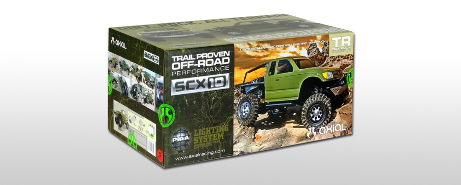
The Axial look and feel had been worked out to the point that our packaging and print collateral had a cohesive look.
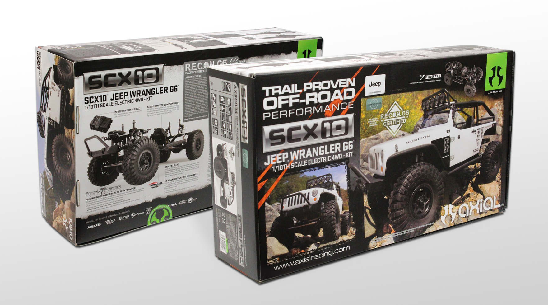
A couple of the most current packaging designs by Axial’s creatives. Packaging photography by BigSquidRC.
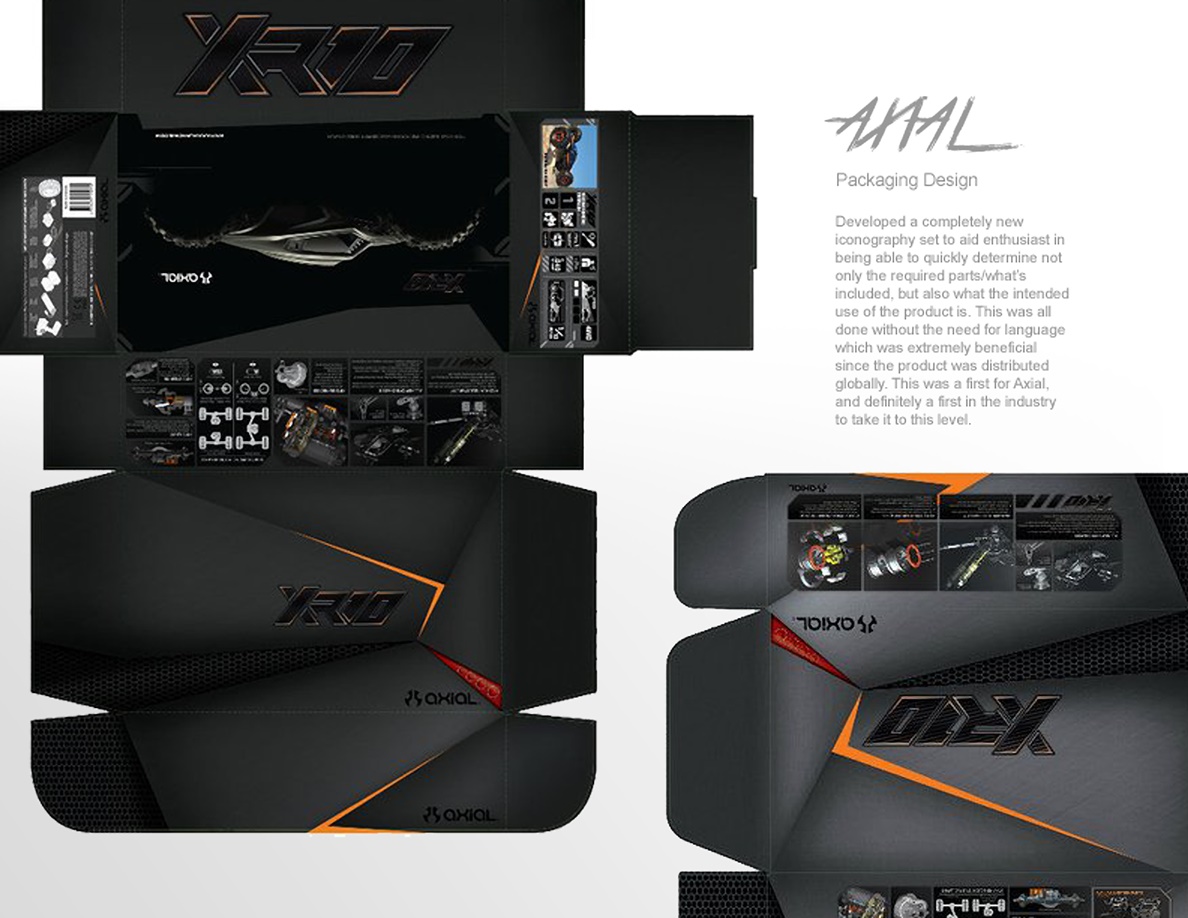
The packaging design was based off of the body design of the XR10, and I played creative director on this project with our talented graphic designer who had an extensive history in the skate/action sports industry.
Skunk2
My role: branding, marketing, graphic design, copywriter.
At Group-A/Skunk2 I had been working on revising the Flash (haha, yea Flash) based website to a proprietary CMS (written in Python) that was a combination of an eCommerce solution tied into it.

The early photography was shot by Frank B. who I learned a lot from. His photography is what made things shine, so I designed a lot of the designs around his photography.

The existing look’n’feel was something I wanted to change which had a quirky surf and cartoon look with the colors of the logo being primarily yellow with black and red accents. The new look and feel, I reduced the color palette down by removing the oval background of the Skunk2 logo, and I stuck with black which was the original color used for the original Skunkworks branding.