Just a few of the marks I have worked on directly or led a designer or team on.
We are the Flock
The company:digital marketing company: social, influencer, and SEO/SEM in the food and restaurant industry.
My role: from concept to completion.
Objective: to incporpate a connection to a “flock,” yet minimized to the point it doesn’t come off as a business focused literally on birds.

Oishii Desu (“it’s delicious”)
The company: blog about Japanese food and culture because there’s a culture behind what you eat.
My role: from concept to completion.
Objective: the site is marketed directly towards Americans on the West Coast (LA, SF, to CO) with an interest in Japanese food and culture.

Race Technologies
The company: logistics and market partner to Brembo.
My role: as the marketing director, I worked with a freelance designer I had worked with on a couple projects in the past. I am always lucky when he has the time to work on a project because he contributes in ways more than expected.
Objective: the original typography was a stretched and squished Arial bold with a mix of lowercase and italicized type.

Axial
The company: radio control (R/C) hobby grade manfucturer specializing in rock crawlers.
My role: marketing director.
Objective: the last thing I want to do is change the logo or any branded elments just for the hell of it, but with the Axial logo I just wanted to minimize the use of color. I did that by reducing the logo to a monotone.

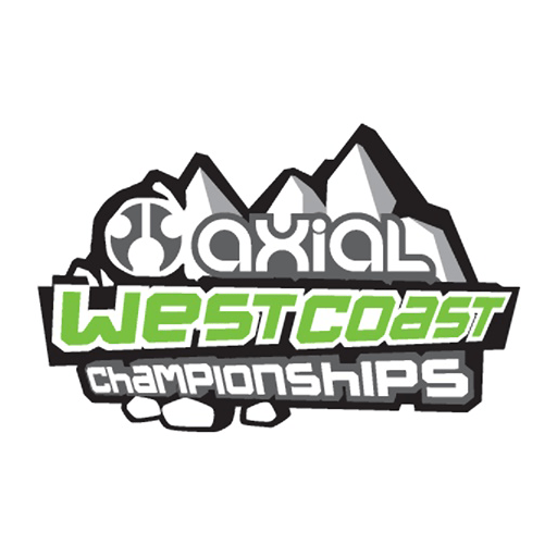
Axial West Coast Championships
The company: this logo was design in 2009 for an annual event.
My role: marketing director, and I can’t remember if this was in-house or an outside contractor. At that time, we were lucky to have found the designer we had, along with the a couple creatives we had in our arsenal.
Objective: to develop a logo that would communicate what sort of event it was, along with further extending the newly rolled out brand elements of the new Axial look and feel that was being utilized in print ads to packaging.
